
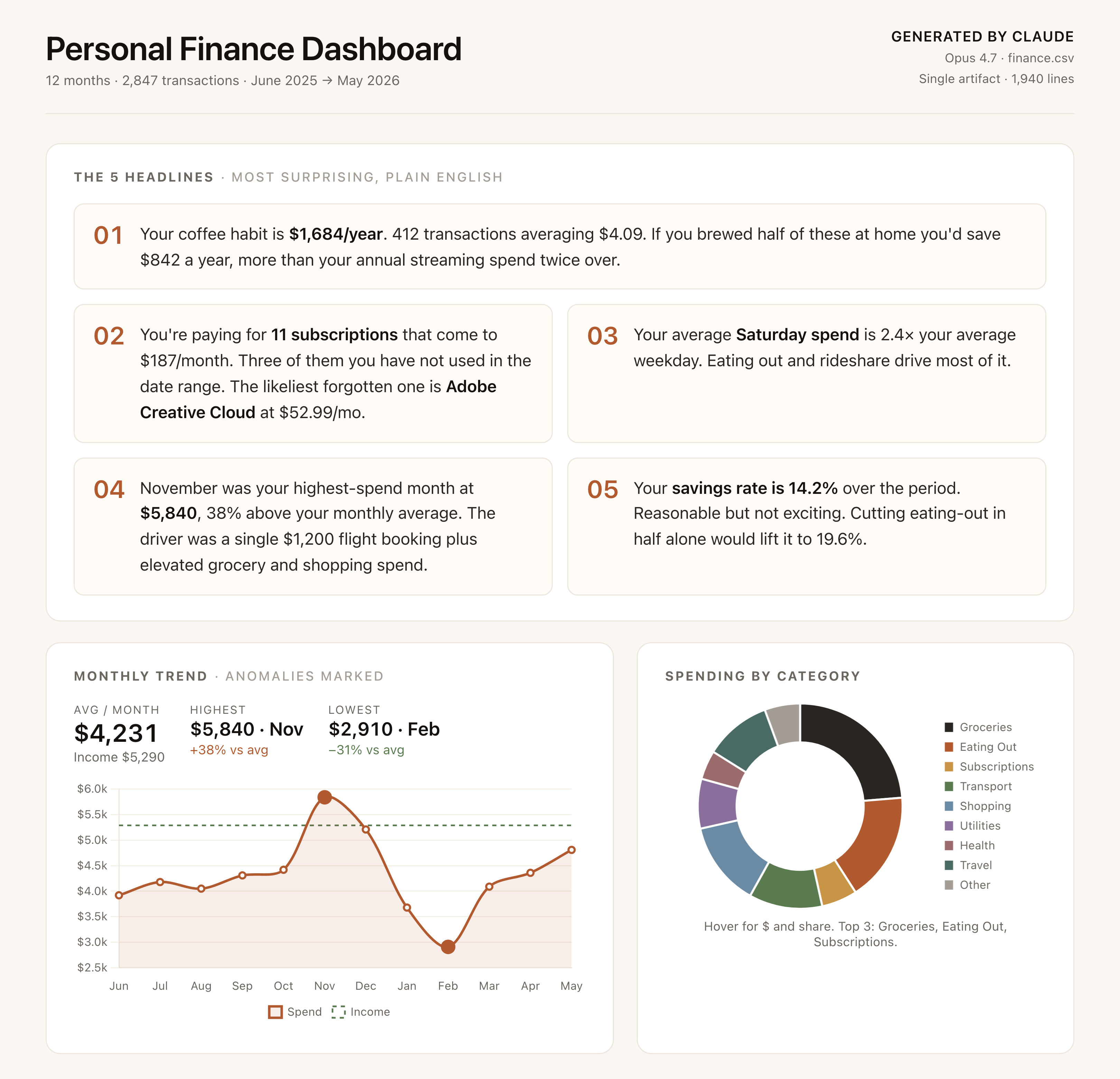
What this guide gives you
Most people have a vague sense that their money is leaking somewhere. Cards, statements, a banking app that shows the last 30 days as a flat list. The information is all there. It is just not in a shape you can act on.
This guide hands you a 60-second workflow that turns a year of bank transactions into a real finance dashboard, the kind of thing a junior analyst would charge you a week of work for. Then it goes deep on the follow-up prompts that turn that dashboard from a pretty PDF into actual decisions: what to cancel, what to cut, how to hit a real savings goal by a real date.
You will not install anything. You will not write any code. You will not need a spreadsheet. The only inputs are a CSV from your bank and one Claude account.
Who this is for
- Anyone who has been meaning to "do a proper budget" and keeps not doing it. This is the lowest-friction version that actually produces something usable.
- Founders and freelancers who mix personal and business spend and need a quick categorisation pass before tax time.
- Couples or housemates who want a clean split of shared bills versus individual spend without arguing over a spreadsheet.
- Anyone curious about what their last year of spending actually says about them.
What you need before you start
- A bank account that lets you export transactions as CSV (every major bank does, the link is just buried).
- A Claude account. Free tier works for the first dashboard. Pro is worth it if you want longer chats and more follow-up prompts in a single thread.
- About five minutes to download the CSV, plus five minutes to paste the prompt and read the result.
Why Claude and not a budgeting app
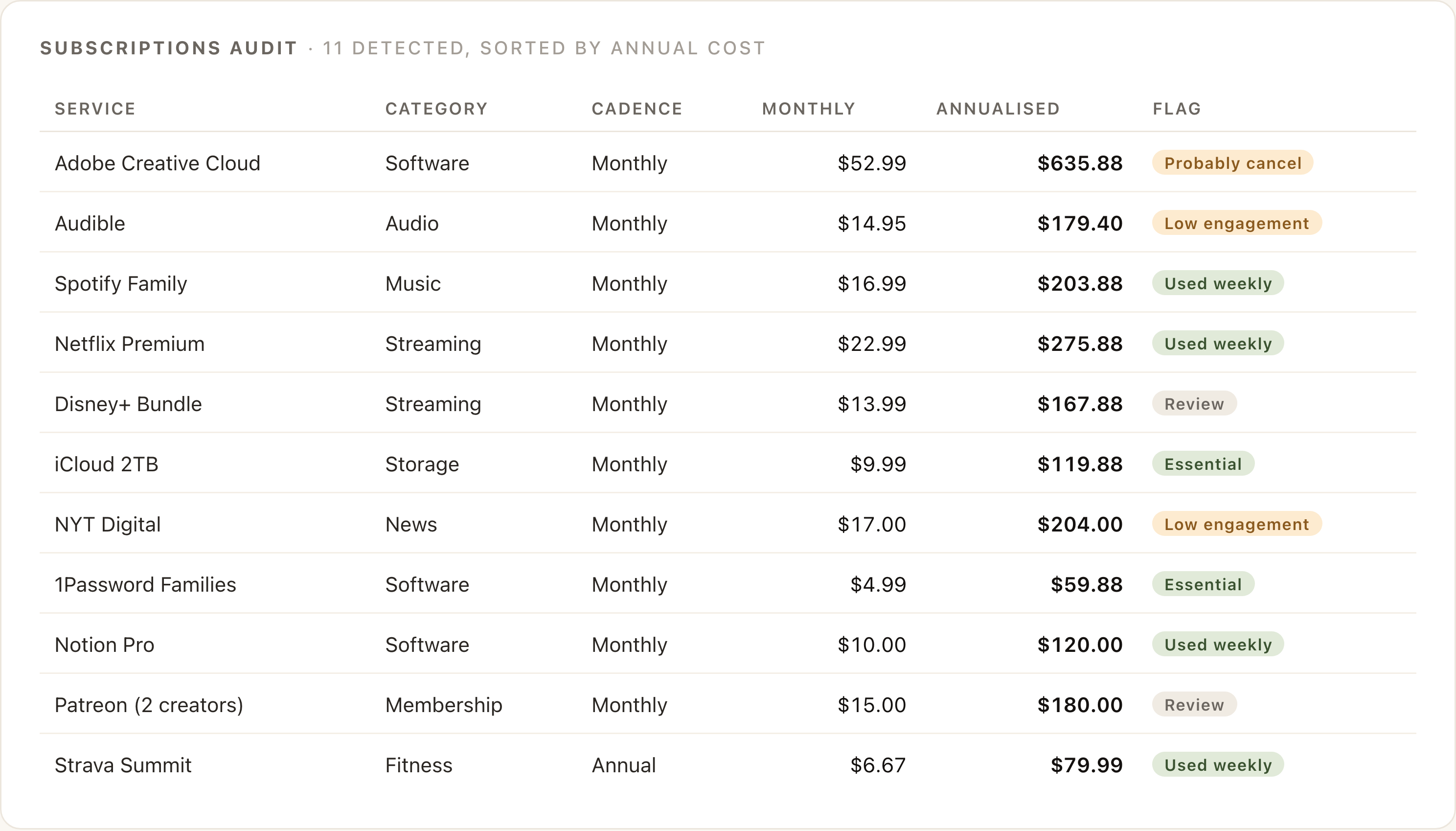
The honest answer: budgeting apps are great at tracking, terrible at thinking. They will show you a pie chart. They will not tell you that your November anomaly was a single flight booking plus elevated grocery spend, or that your weekend rideshare is your weakest category, or that the subscription you forgot about is the one bleeding $635 a year.
Claude does that thinking automatically, in plain English, the first time you ask. It reads the CSV, categorises every line, finds the patterns, and writes the dashboard. No Plaid connection, no recurring sync, no "premium tier to unlock insights." It is a one-shot analysis pass on a file you already own.
Where this beats Mint, Monarch, YNAB, etc.
- No account linking. Your data never leaves the conversation. No third party stores your login.
- It writes the analysis. Budgeting apps surface the data; they do not narrate it. Claude does both.
- It answers follow-ups. The dashboard is the start of a conversation, not the end. "What changes if I cut eating out in half?" is one message away.
- It is free for a first pass. The whole flow runs on Claude's free tier.
Where it loses
- Not a tracker. If you want a live, always-on view of your money, a budgeting app is the right tool. This is a periodic deep dive, monthly, quarterly, year-end.
- No bank-side categorisation rules. You re-run the prompt each time, you do not build up a learned model.
- It can mislabel unusual merchants. "TFL TRAVEL CH" is obviously transport; "PYPL *NEXTDOOR" is anyone's guess. We will deal with that in the follow-ups.
Step 1 · Export the CSV from your bank
Every bank exports CSV. The link is rarely on the dashboard, it lives under Statements, Activity, or sometimes Profile. A few quick paths:
- Monzo: Account → Transactions → three-dot menu → Export. Pick a date range, CSV.
- Chase: Statements → Manage statements → Download activity. Choose "spreadsheet (CSV)".
- Starling: Web app → Spending → Statements → Export. CSV.
- HSBC: Account summary → Statements → Download. Format dropdown → CSV.
- Wise: Activity → Statement → Download → CSV.
- Commonwealth Bank (AU): Transactions → Export → Date range → CSV.
- Revolut: Mobile app → Account → Statement → CSV.
How much history to pull
Twelve months is the sweet spot. Long enough that the monthly-trend line is meaningful, long enough that recurring subscriptions show up clearly, short enough that Claude reads it in seconds. Less than three months is too thin: no real trend, no anomaly detection, no subscription pattern. More than two years works, but the marginal insight per extra month falls off fast.
If your bank caps exports at a shorter window (some do, especially in Europe), pull as many separate windows as you need and concatenate them into a single CSV before uploading. A text editor or Google Sheets will do the merge in 30 seconds. Or upload them separately and tell Claude to merge them.
Cleanup before upload (one minute)
Most exports are usable as-is. Two things to check:
- The first row should be column headers (Date, Description, Amount, Balance, etc.). If yours has metadata rows at the top, delete them.
- Sign convention should be consistent. Some banks export debits as positive numbers, some as negative. If yours is mixed (separate debit/credit columns), that is fine, Claude handles both.
Step 2 · Open Claude and drop the file in
Go to claude.ai. Start a new chat. Drag the CSV directly into the message box. You will see a small file chip appear above the input, showing the filename and size. That is the attachment, ready to send.
Do not type anything else yet. The prompt comes next, and it is long. You want to paste it cleanly without the file context getting buried by surrounding words.
Which Claude model to use
Use whatever your account defaults to. Opus 4.7 produces the densest dashboard. Sonnet is faster and 90% as good. Haiku will work for the categorisation but the dashboard will feel thinner, save it for follow-up questions in the same chat.
Free vs Pro
- Free: works for the first dashboard and a handful of follow-ups. You will likely hit the message cap mid-conversation if you go deep on follow-ups.
- Pro: removes the cap concern, lets you keep the same chat open for days and build on the dashboard over time. Worth it if you are doing this monthly or quarterly.
- Max / Team: only matters if you are running this for clients or doing multiple finance analyses in parallel.
Step 3 · The prompt that does the real work
Paste the following verbatim into the chat. Do not try to shorten it. The length is deliberate, it signals to Claude that what comes back should be a real artifact, not a four-paragraph summary.
Hit send. The artifact panel will open on the right and Claude will start building. The first dashboard takes 20 to 40 seconds on Opus, less on Sonnet. Do not refresh; the artifact streams in.
Why this prompt is structured the way it is
- Three named phases (CATEGORIZE, ANALYSE, THE DASHBOARD) act as scaffolding. Claude treats them as distinct tasks and produces all three rather than skipping to the chart and forgetting the categorisation.
- Listing the categories explicitly removes variance. Without the list you will get whatever taxonomy Claude defaults to that day, which makes month-over-month comparison messy.
- Naming the dashboard sections forces structure. A vague "build me a dashboard" produces a single chart and a paragraph. This produces eight components, in order, every time.
- The last paragraph ("I'll ask follow-up questions after") is the most important sentence in the prompt. It tells Claude to set the dashboard up for iteration, which is the difference between a one-shot artifact and a real analysis surface.
Step 4 · What Claude actually builds
A single self-contained HTML artifact, roughly 1500 to 2500 lines of code, opens in the side panel. You can scroll, hover, sort, search. The structure below is what every run produces, in roughly this order.
The 5 headlines
Top of the page. Five plain-English findings, the most surprising or actionable things in your data. This section alone is worth the prompt: it pre-answers the question "what should I actually care about?"
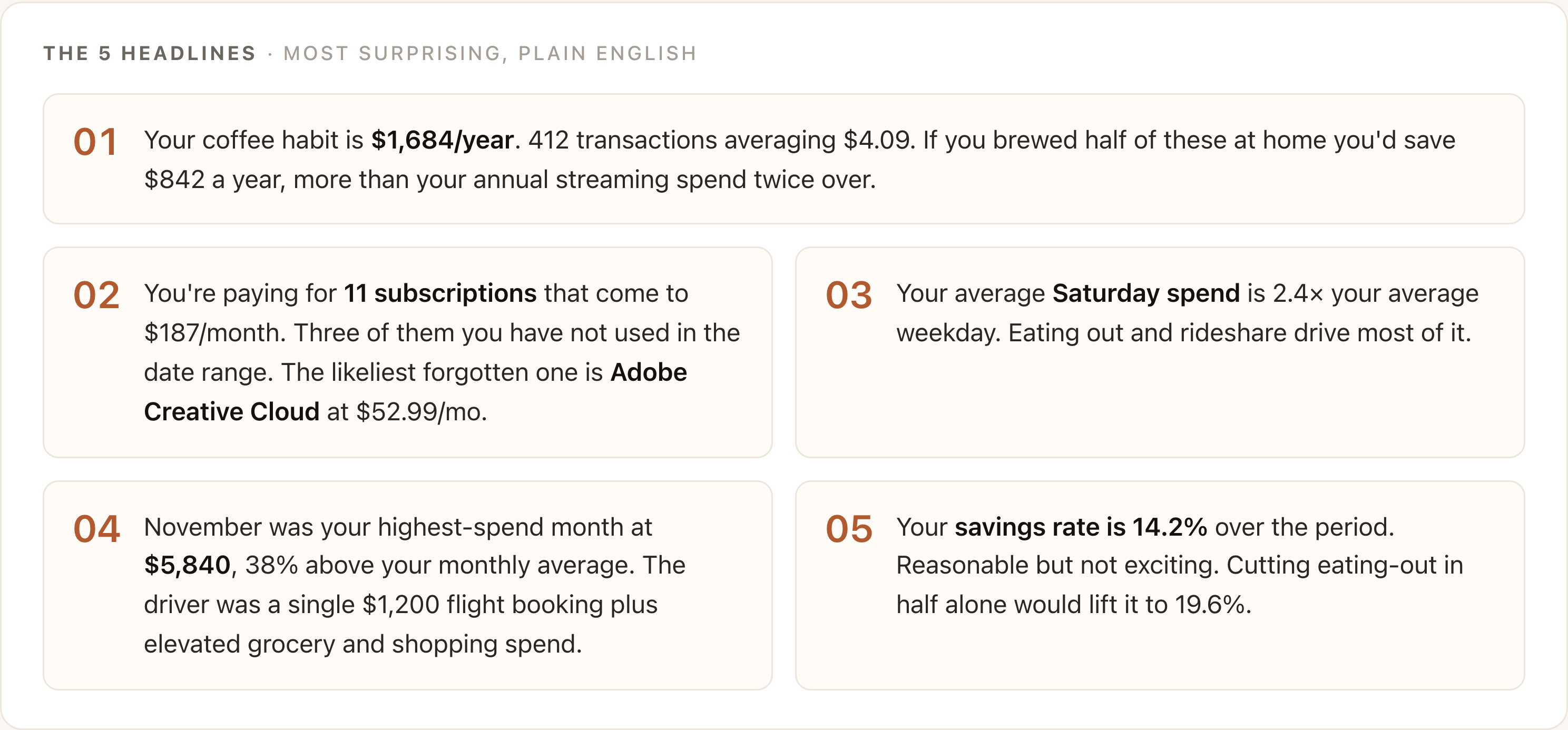
Spending by category (donut)
A doughnut chart with the eighteen categories from the prompt. Hover for the dollar figure and percentage share. The interesting thing here is usually not the biggest slice (probably groceries), it is the third or fourth slice, which is almost always larger than people expect.
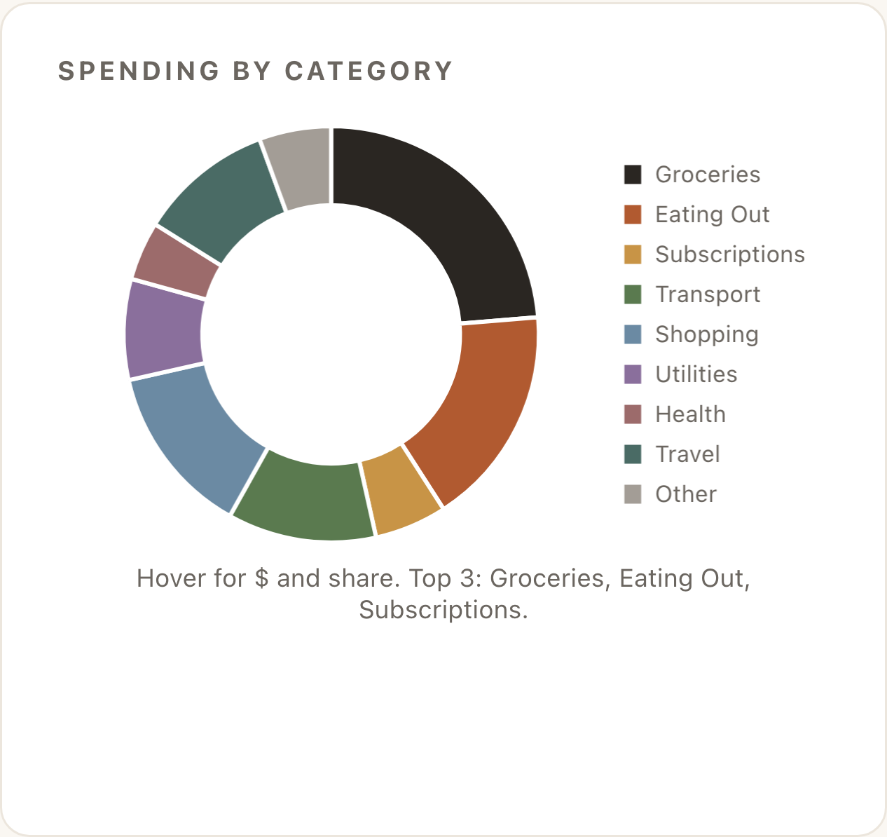
Monthly trend with anomalies
Twelve-month line chart of spending, with the income line overlaid as a dashed reference. Anomaly months (significantly above or below the rolling average) are marked with a filled dot rather than an outline. Hover for the breakdown of what drove the anomaly.
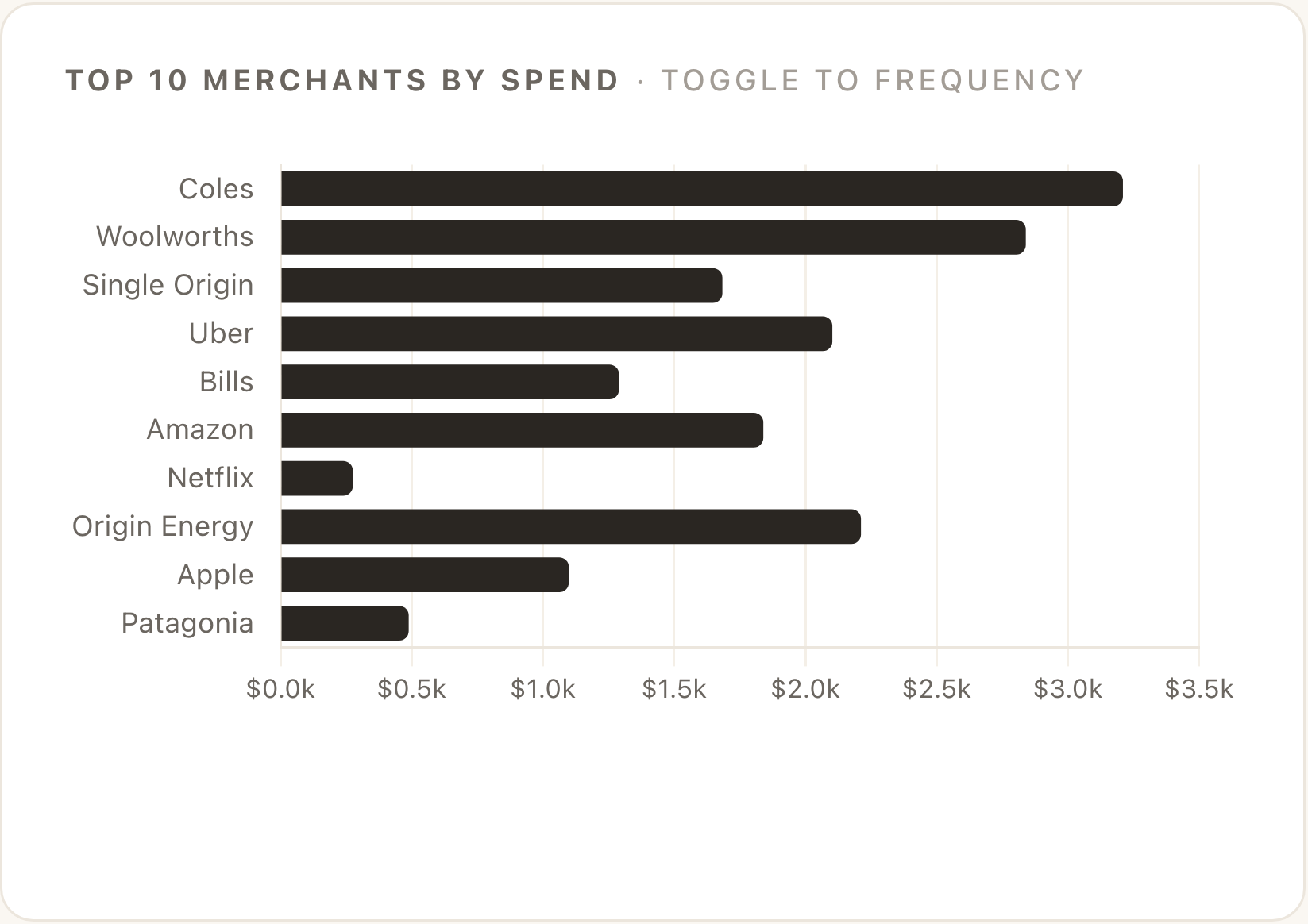
Top 10 merchants by spend
A horizontal bar chart, sorted by total spend. There is usually a toggle to switch to frequency view (most-visited rather than most-spent), which uncovers a different story, the cafe you go to twice a week shows up here even though no single transaction was large.
Subscriptions audit
Every recurring transaction Claude detected, with monthly cost, annualised cost, and a flag column. Sorted by annual cost by default, so the biggest bleeders are at the top. The flag is the column to read first, "probably cancel" and "low engagement" are the action items.
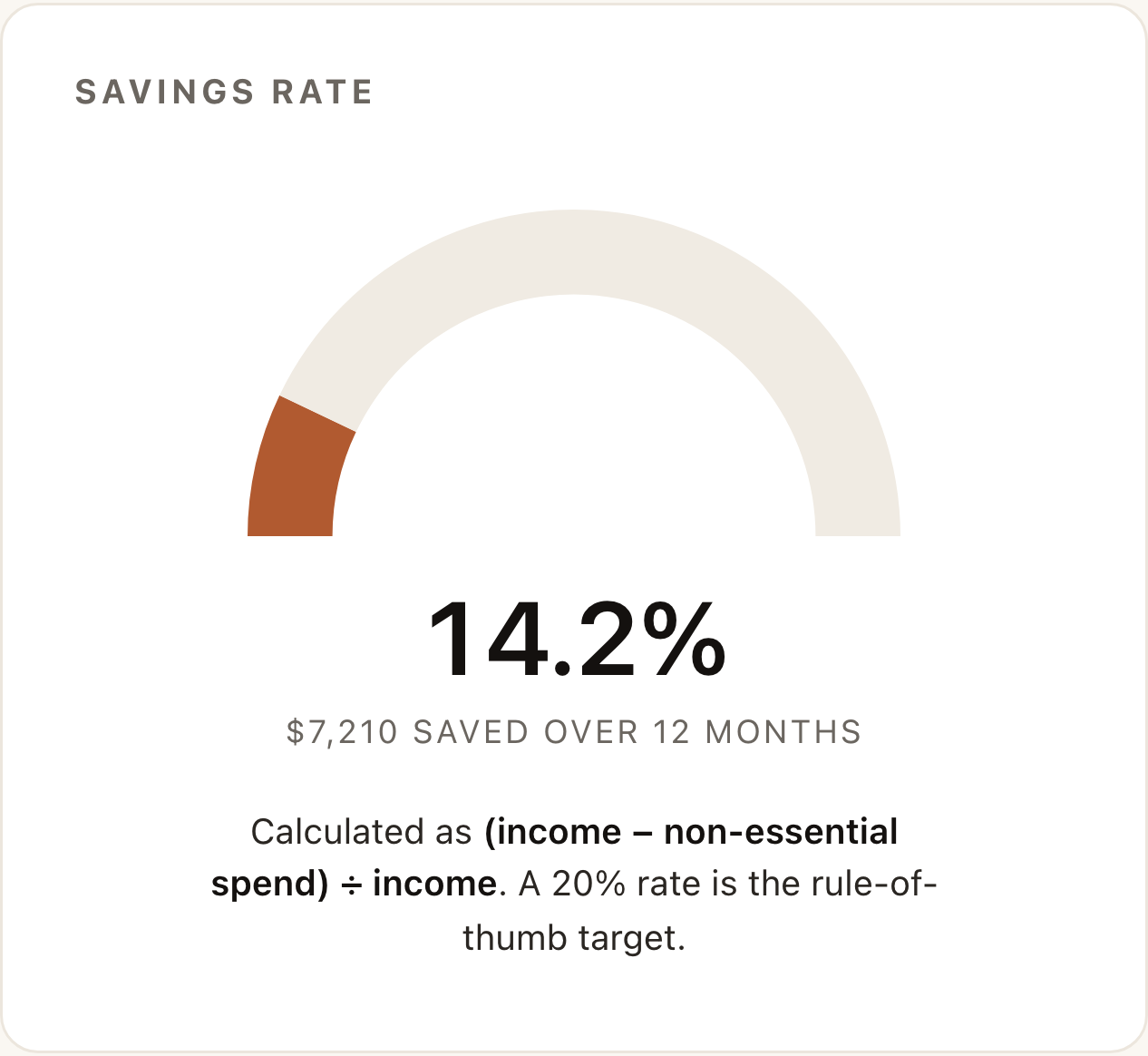
Savings rate gauge
A half-gauge showing your savings rate as a percentage, with the absolute dollar figure underneath. 20% is the rule-of-thumb target; below 10% is a flag; above 30% is unusual and almost always means you are running a household with two incomes on the account.
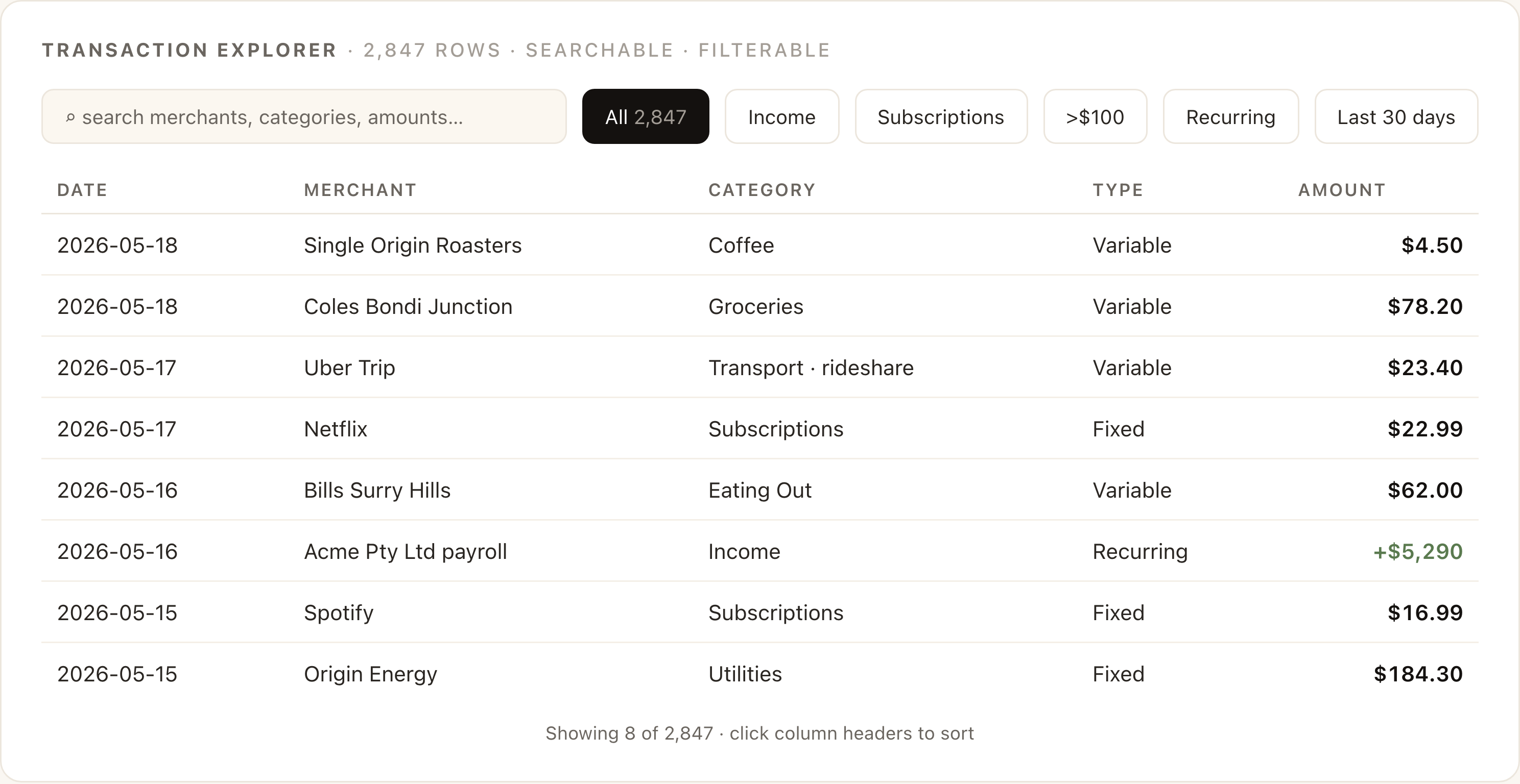
Transaction explorer
A searchable, filterable table at the bottom containing every transaction. Use it for sanity-checking, did Claude really categorise that as "Coffee" or did it count the Saturday brunch as well? Click a column header to sort. Type in the search to find a specific merchant.
Privacy and what to know before you upload
You are uploading a year of your spending to a third-party AI. Three things to know, and one thing to consider.
What Anthropic actually sees
- The CSV is read into the conversation context. On Anthropic's consumer plans (Free, Pro, Max), conversation content is not used to train models by default, and you can confirm or change this in Settings → Privacy.
- On Team and Enterprise plans, training opt-out is the default.
- The file is stored alongside the conversation. Delete the conversation when you are done if you want the file gone too.
What to anonymise before uploading
For most personal accounts, nothing. A list of merchant names and amounts is not particularly sensitive. For joint or business accounts, or if you are paranoid:
- Find-and-replace any personal payee names (rent payments to a landlord, transfers to family) with generic labels ("RENT", "FAMILY_TRANSFER"). The dashboard still works; only the names change.
- Strip account numbers and sort codes if your bank embeds them in the Description field. Most do not. Some European banks do.
- If the file came from a business account and contains client names, do not upload it to a personal Claude account. Use a Team or Enterprise workspace, or strip the names first.
One thing to consider
The dashboard is rendered inside Claude's artifact panel. If you screenshot it for a video, a tweet, or a blog post, the screenshot contains real merchant names and real dollar amounts. Decide whether that is fine before you publish. The dashboard in this guide is built on synthetic data for exactly this reason.
The budget playbook · 11 follow-up prompts that actually move money
The dashboard is the start, not the end. Once it is rendered, the same chat can answer almost anything you ask, because Claude already has the full transaction history loaded into context. The next eleven prompts are the ones I run, grouped by what you are trying to do.
Paste them verbatim. Each one is calibrated to produce a structured, actionable response rather than a wall of prose. They are also designed to chain, the output of one is often a useful input to the next.
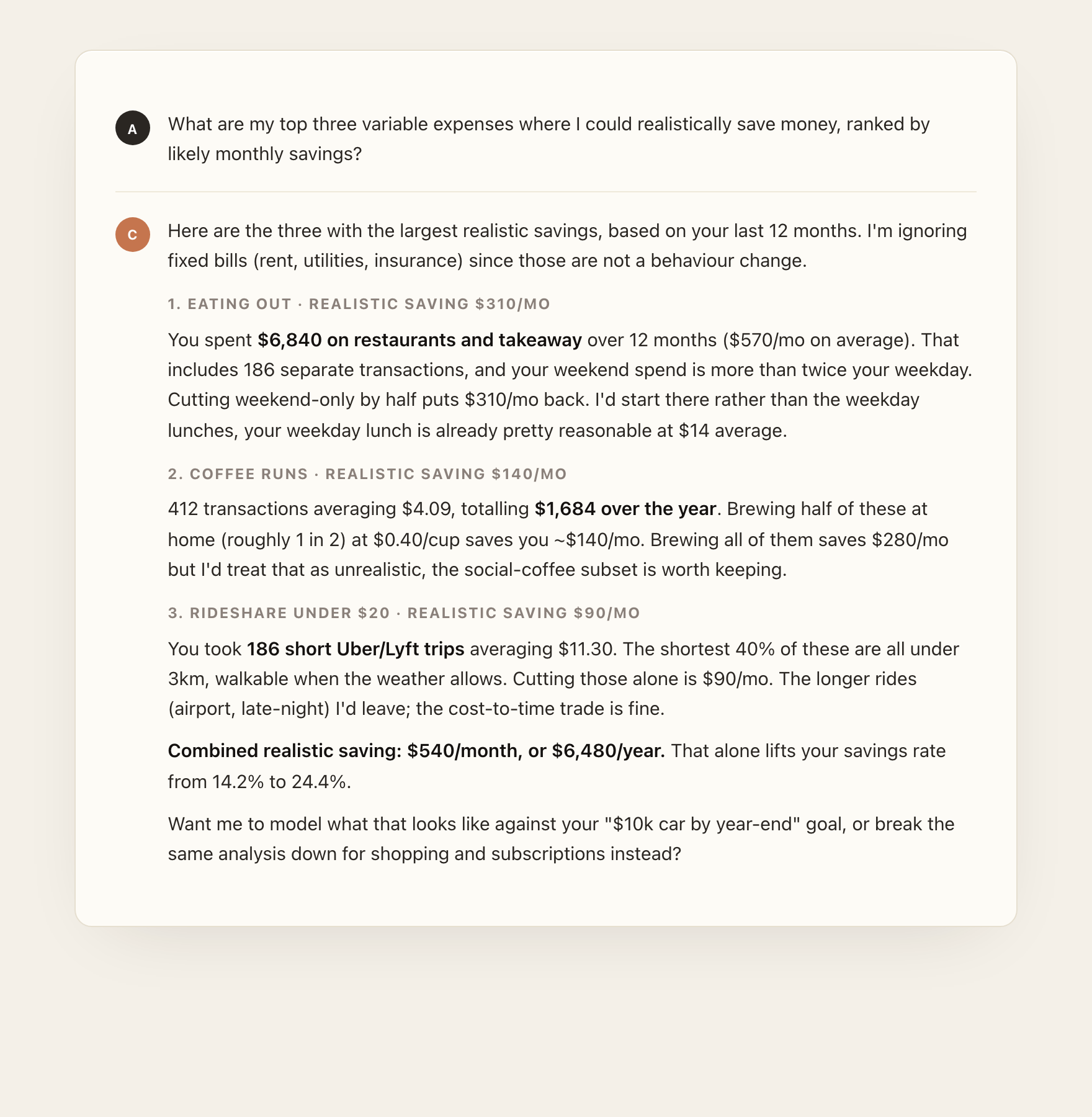
1. Find the three biggest wins fast
Use this when you want a quick, prioritised action list before you commit to a real budget. This is the prompt I always start with.
2. Set a real goal with a real deadline
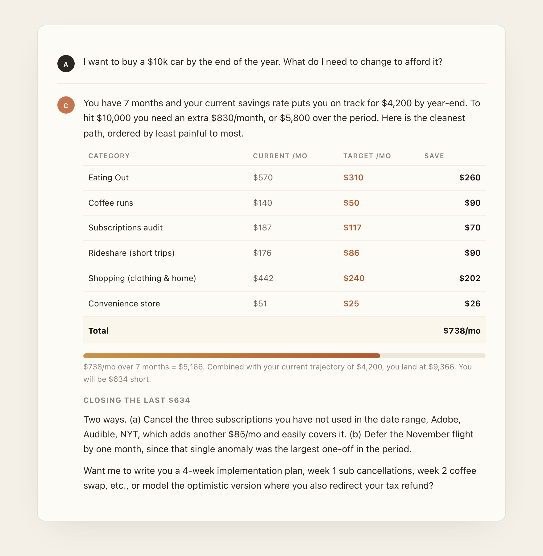
Goals are the single biggest unlock. A "save more" prompt produces vague advice; a "save $10k for a car by year-end" prompt produces a budget. Replace the goal and deadline with yours.
3. Cancel the subscriptions you forgot about
4. Model the "what if I cut X in half" question
For when you want to know whether the painful change is worth it before you actually make it.
5. Find duplicates and possible fraud
Genuinely useful. Banks miss a surprising amount of small duplicate charges. Run this at least once.
6. Plan a no-spend weekend
7. Pull out business expenses for tax
For freelancers and side-hustlers running everything through one account. Replace the categories with whatever your tax authority uses.
8. Split shared spend between two people
9. Drill into a specific merchant
When the dashboard surfaces something surprising and you want to understand it.
10. Optimise a debt payoff
Only run this if you have an actual balance to pay down. The dashboard sees the spending; you tell it the debt.
11. The monthly review prompt
For after you have done this once and want to compare against last month. Re-run the original dashboard prompt on the new CSV in a fresh chat first, then paste this in:
Five mistakes that ruin the result
- Uploading three months of data and expecting a useful trend. The whole point of "monthly trend" is having enough months to see a trend. Twelve. Always.
- Trying to type the prompt instead of pasting it. Paste from a saved text file. Typing introduces mistakes that change the shape of the output, and the on-camera-ness of typing is not worth the loss of fidelity.
- Treating the dashboard as the answer. The dashboard is the question generator. The follow-ups are where the money actually moves. Run at least three from the playbook above before you call it done.
- Re-prompting when a follow-up would do. If the dashboard is mostly right but the savings rate calculation looks wrong, do not re-run the whole prompt. Ask: "Recalculate the savings rate using your existing categorisation but excluding pension contributions from non-essential spend." One message, fixed.
- Skipping the duplicates/fraud sweep. It takes 30 seconds and catches real money, recurring charges from services you cancelled, duplicate restaurant bills from a flaky terminal. Run it once per year minimum.
Three variations worth knowing
Same workflow, slightly different prompt, different outputs. Use these when the headline dashboard is not the shape you need.
Subscription audit only (3-minute run)
When you just want to know what you are paying for and which ones to cancel. Skip the full dashboard.
Tax prep, deep version
For when you actually need a year-end pack you can hand to an accountant.
Couples / household split
For joint accounts where both partners want a clean breakdown without arguing over a spreadsheet.
Where to go from here
Three things, in order, if you have not done this before:
- Run the headline workflow once. Pull 12 months, paste the prompt, look at the dashboard. Do not skip to the follow-ups. The dashboard is the shared context for everything that comes after.
- Run prompts 1, 3, and 5 from the budget playbook. The three-cuts prompt to set priorities, the subscription audit to find the easy wins, the fraud sweep to catch the small leaks. That is roughly $200 to $500 of recoverable spend for most people on a first pass.
- Pick a real goal and run prompt 2. A savings target, a debt payoff, a holiday, a piece of equipment, a car. The moment the model is solving a real problem, the playbook stops being an exercise and becomes a budget you will actually follow.
Set a recurring calendar event to run the monthly-review prompt on the first of each month. Twelve minutes of work; compounds for years.
Further reading
- Anthropic: Working with files in Claude (support.claude.com)
- Anthropic: Privacy and data usage on consumer plans (anthropic.com/privacy)
- Claude Artifacts overview (support.claude.com, "What are artifacts")
- The 60-second short version of this workflow on YouTube @alistairinai